Ce site utilise des cookies essentiels pour son fonctionnement (formulaire de contact via EmailJS). Aucun cookie publicitaire ou de tracking. En savoir plus
Increasing retention without adding friction or moderation cost.
UX Case StudyMobile Game DesignRetention StrategySocial SystemsProduct Design
TL;DR
Problem:
Lack of social feedback loop in a mobile game
Solution:
Passive social system embedded in gameplay
Impact:
Improved D7 and D30 retention
Approach:
Rapid prototyping using Figma and Claude Code
Project
Venue, Design Studios (Phase 2 Social)
Role
Lead UX & Product Designer
Studio
Yummy Labs in partnership with Superbloom
Deliverables
Concept system · Discovery flow · Interaction model · Presentation deck
Constraint
2 week sprint
Recognition
Top Sprinter, March 2026
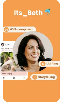
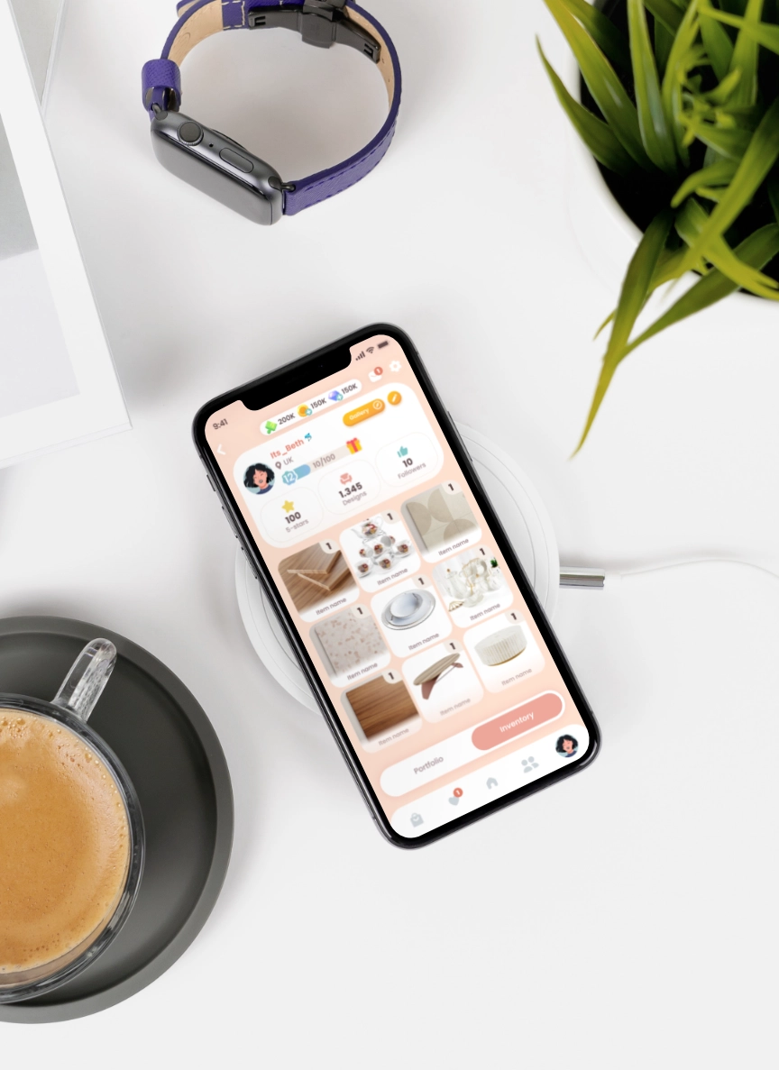
Its_Beth 🐬
20h in game
600 designs
Lvl 12
Minimalism style
The Problem
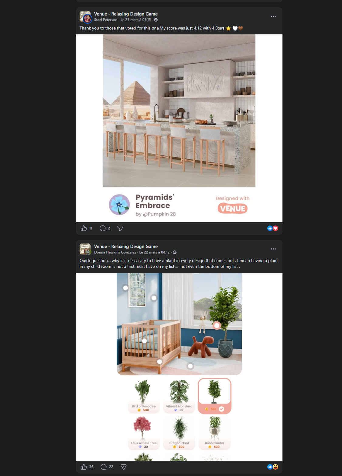
Every night, Beth closes Venue and opens Facebook.
She's been playing for months. She designs rooms, submits them to be voted on, collects rewards. She's engaged. She's good at it. But when she wants to feel something — to share a result, to see if anyone noticed — the game has nothing to offer. So she goes elsewhere.
The problem wasn't low engagement.
Venue had :
4M+ downloads — 90% female player base — strong daily loops.
The product lacked a social feedback loop that made user activity feel meaningful.
This created a structural UX problem:
No in-product recognition after submission
No visibility into engagement from other players
No persistent social context to return to
UX Challenge: How might we design social features that improve retention without adding friction or moderation complexity?
The Insight
Most social features in mobile games rely on explicit actions: joining groups, adding friends, or posting content. But this creates friction. Players like Beth don’t want to perform social interaction; they want to feel it naturally.
Two things follow from that:
Low cognition load
The moment you ask someone to join, you create a moment where they can say no. Opt-in mechanics are opt-out risks. Every explicit step leaks.
No moderation required
Social mechanics that rely on moderation or settings to stay non-toxic will eventually fail. Toxicity needs to be structurally impossible, not just manageable.
The Design Challenge
SuperBloom’s brief: design a group-based social system for Venue that encourages collaboration, Improves player retention (D7 / D30), requires zero moderation and ddds no extra cognitive load
Three hard constraints made this interesting:
Anonymous voting
Players can't choose whose work they see
Casual play
No tolerance for extra homework
No chat
no text, no moderation overhead.
This is not a "guild war" system. This is a creative collective.
Design Principles
Before touching a single screen, I defined four non-negotiables that every mechanic had to pass.
1
No toxicity by design
If a mechanic can produce a bad feeling, it will. The fix isn't a setting — it's removing the mechanism. No leaderboards. No individual contribution visibility. No way to compare members.
2
No penalty for absence
Missing a week should carry zero guilt signal. No "you let your team down." No streak breaks. Contribution is meaningful when you show up, invisible when you don't.
3
Passive participation
The system watches what players already do and uses it as contribution. Normal play is participation. No opt-in threshold, no confirmation modal.
4
Collective progression
Milestones are collective. Rewards are shared. Progress is one bar, not aggregated personal bars. The Studio succeeds together or not at all.
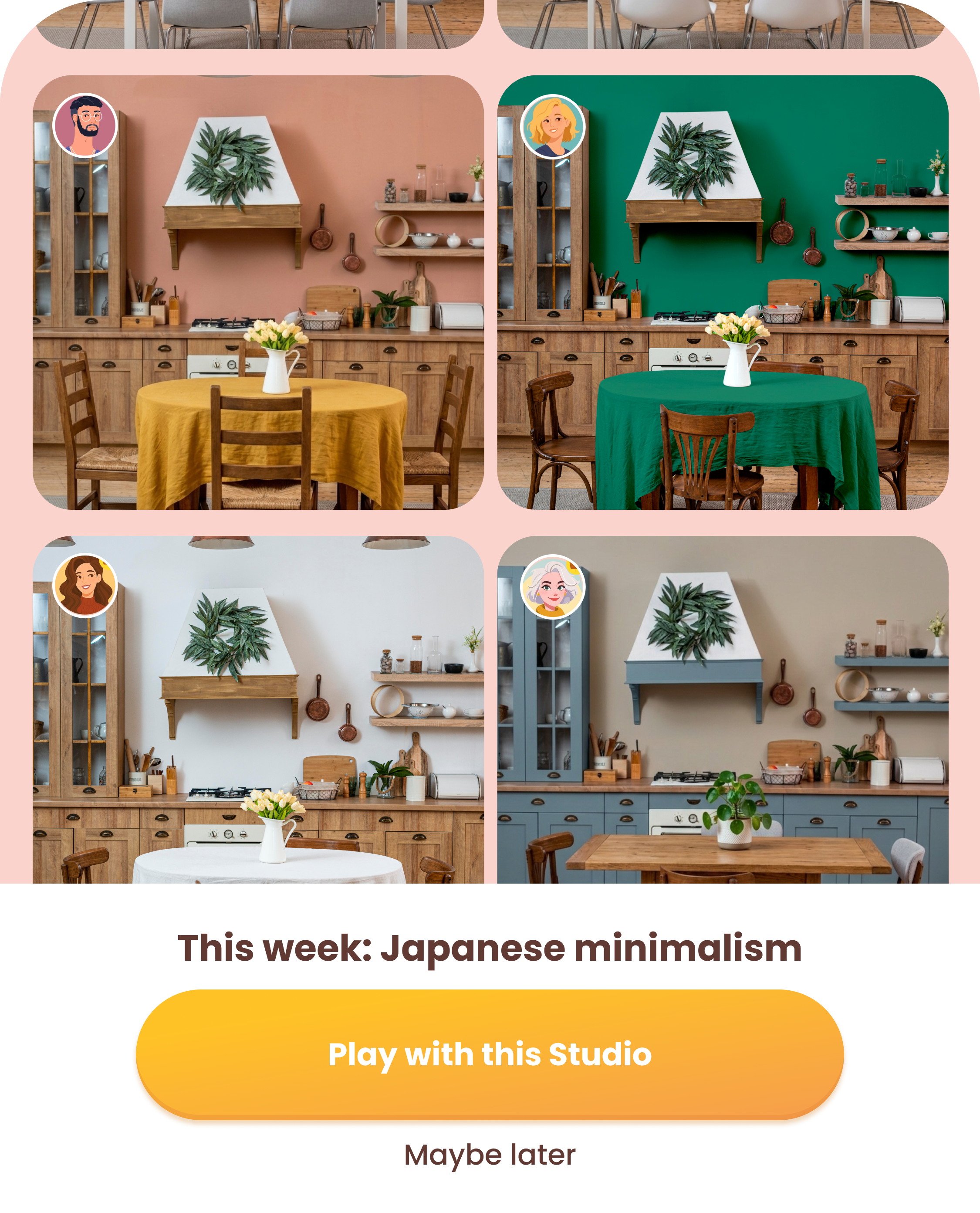
The Solution · Design Studios
Design Studios is a passive community membership system embedded in Venue's existing game loop.
Players contribute to a shared Studio by playing normally
submitting designs
voting
completing chapters
Shared goal
No new behaviour required.
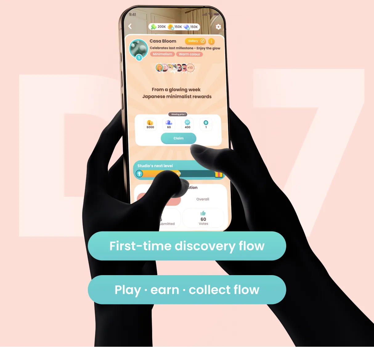
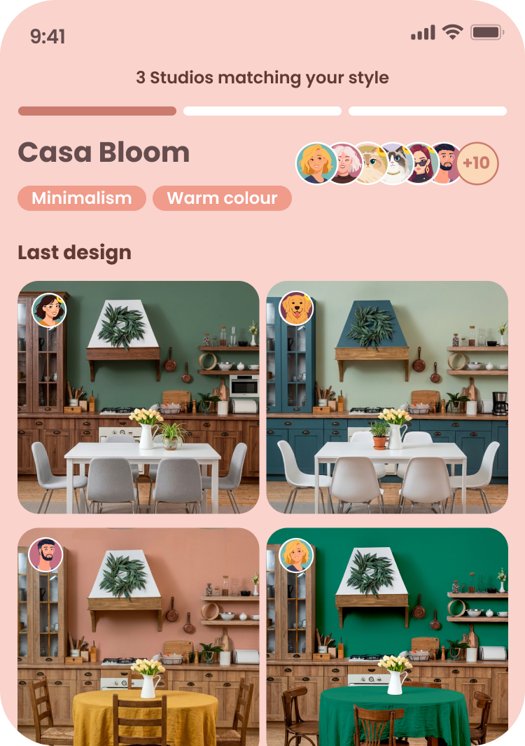
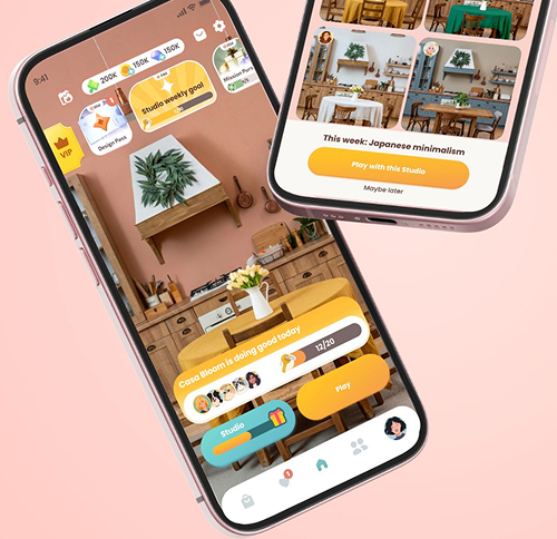
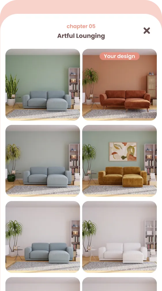
Each Studio has 10–20 members matched on design aesthetic, a shared weekly goal, a Studio Room that grows as the Studio levels up, and a collective gallery where members' submitted designs appear for each other.
The Studio is named and curated. Ours: Casa Bloom 🌸
These constraints aren't new.
The best games already solved them, just never combined them.
State of Decay 2
The volunteering state
Journey
No toxicity by architecture
Neko Atsume
Absence without guilt
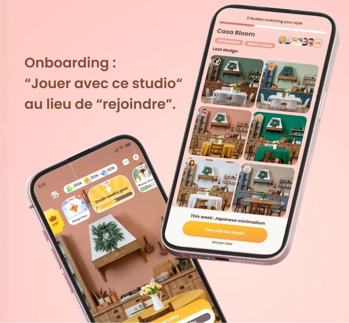
The Joining Mechanic · "Frictionless Belonging"
This was the most consequential decision in the entire system.
During onboarding, the player taps a Studio and goes back to play. Nothing changes on screen.
But behind the scenes she knows, everything she already does starts contributing to something shared.
In the first two weeks, Beth is technically a volunteer. She contributes without changing anything she already does, without label, expectation, or visibility.
After two weekly cycles, the transition happens automatically. A quiet status line change appears in her Studio view.
Product decision: Removed all opt-in steps to eliminate friction and increase early engagement.
Language note: The CTA throughout is "Play with this Studio", never "Join Studio." The player is choosing to play, not to commit. That single word swap is load-bearing.
The D7 Discovery Flow · 7 Steps
How does Beth first encounter her Studio? Not through a banner. Not a push notification. Through a milestone.
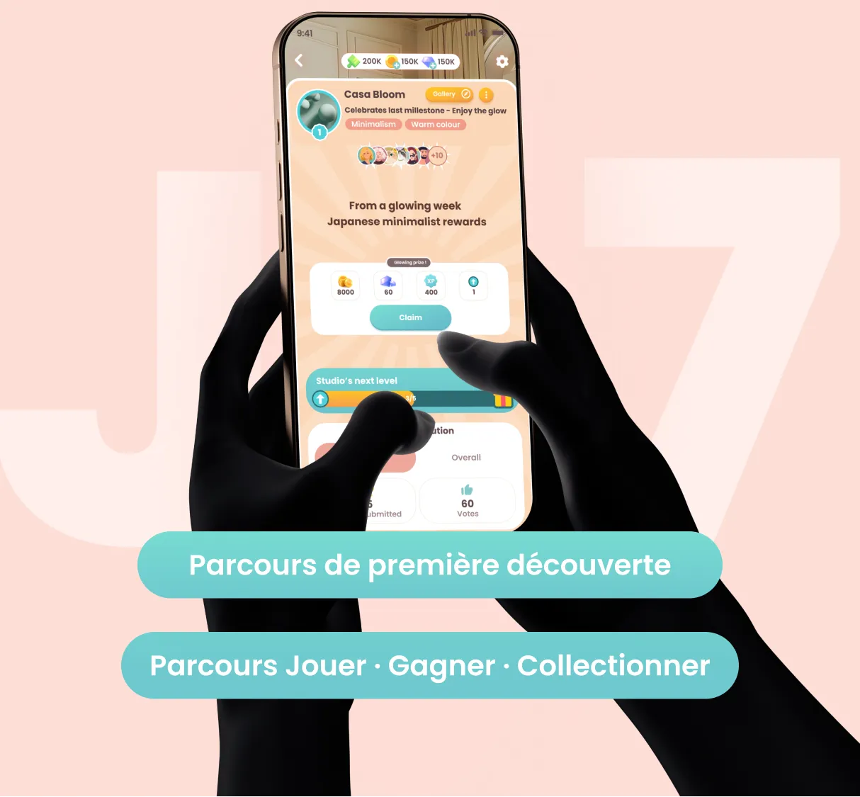
At Day 7, Beth has completed several chapters and been through the voting loop many times. The leaderboard just unlocked. She's reward-loop trained — red dots work on her.
The trigger: 10 designs submitted. Emotional peak. She's claiming a reward when the system opens a door.
1. Milestone moment
Reward claimed.
A brief system message appears.
Emotional peak — high receptivity.
2. Studio reveal
Full-screen overlay.
"You're ready to join a Design Studio."
Maybe later always visible. No pressure.
3. Studio intro
Three concepts only.
Warm language.
No mechanics dump.
Understood in under 10 seconds.
4. Browse Studios
3 curated suggestions based on design style.
Last-design galleries show an already-active community.
5. Confirm join
Studio tagline and member faces before the CTA.
She's joining people, not a system.
6. Studio home
First view of Casa Bloom.
Key tiers visible.
Goal bar live.
Activity feed already moving.
Alive on arrival.
7. Back to her game
No nudge. No new task.
She plays as usual — keys flow automatically.
Same loop, new meaning.
Excited
Curious
Informed
Intrigued
Warm
Belonging
Settled
Product decision: Integrated feature discovery into existing user flow instead of using notifications or external prompts.
Retention System Design
The system runs on two currencies that operate on different clocks — and that distinction does most of the retention work.
Weekly progression
Key
Unlocks the weekly reward tiers:
SparkBloomGlowRadiant
Resets every week. Earned automatically through normal play:
submit a design (+1), complete a vote session (+1), earn a 5-star (+2).
This week. Effort that matters now.
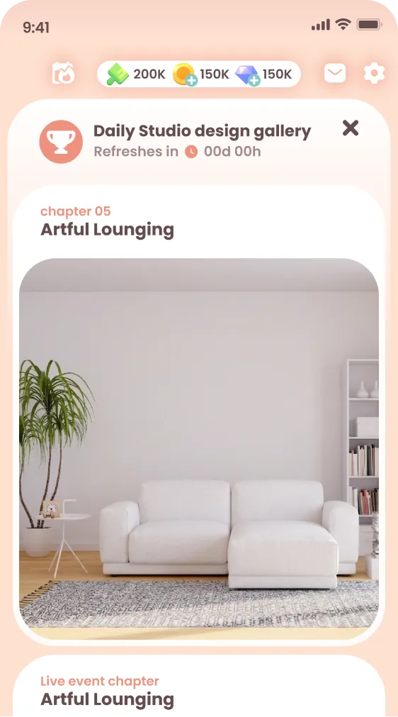
Permanent progression
Arrow
Accumulates across weeks and never resets. Earned exclusively by completing the weekly collective challenge as a Studio. Each Arrow level unlocks a new shared Studio Room permanently.
Forever. Leaving means leaving behind a space she helped build.
Product decision: Separated engagement loops (weekly vs long-term) to support both retention cycles.
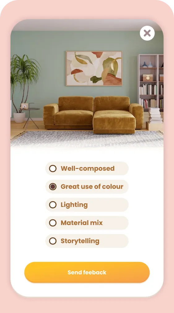
Making Anonymous Voting Feel Human
Voting in Venue is random and anonymous by design. This meant the Studio feed and the voting pool are structurally separate. I couldn't build connection through votes. So I built it elsewhere.
Feedback tags:
When Beth votes, she can leave a preset tag alongside her vote. Not a score but a signal.
For a few seconds, she's not optimizing a result.
She's honoring someone.
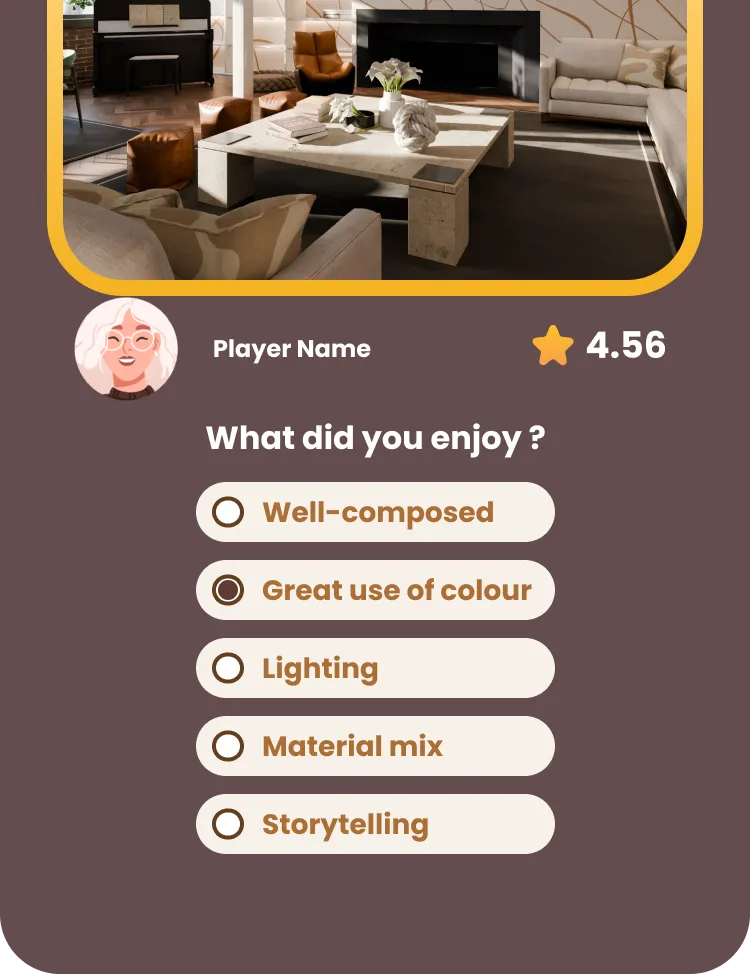
Gallery reactions:
In the Studio gallery, she can react to her mates' designs with preset feedbacks. No text. No moderation required. But suddenly, recognition is possible between people who know each other.
Zero moderation overhead. Structurally safe. Emotionally meaningful. The preset palette is the design decision — not a limitation.
Product decision: Eliminated free-text interactions to remove moderation needs while preserving emotional feedback.
Outcomes
This is a design concept submitted for Phase 2 development evaluation, based on observed player behavior and validated assumptions.
D7
The discovery flow hooks at the exact moment of peak emotional receptivity. Players return for the shared weekly goal before they've consciously decided to stay.
D30
Arrows create identity-level attachment. A player who has contributed to three Studio room unlocks is not the same as a player with no investment. Leaving has a real, visible cost — without any pressure mechanic.
Ops
Zero moderation overhead. No chat. No free text. No reporting flow needed. The system is structurally incapable of producing the content that requires intervention.
How This Would Roll Out
This system wasn't designed to be shipped all at once.
It's structured to be introduced progressively; each phase validating a different layer of the experience before adding complexity.
Phase 1
Validate belonging (D7)
Start with lightweight Studio assignment and passive contribution.
Each phase builds on the previous one, turning a design concept into a measurable system.
What I'd Do Next
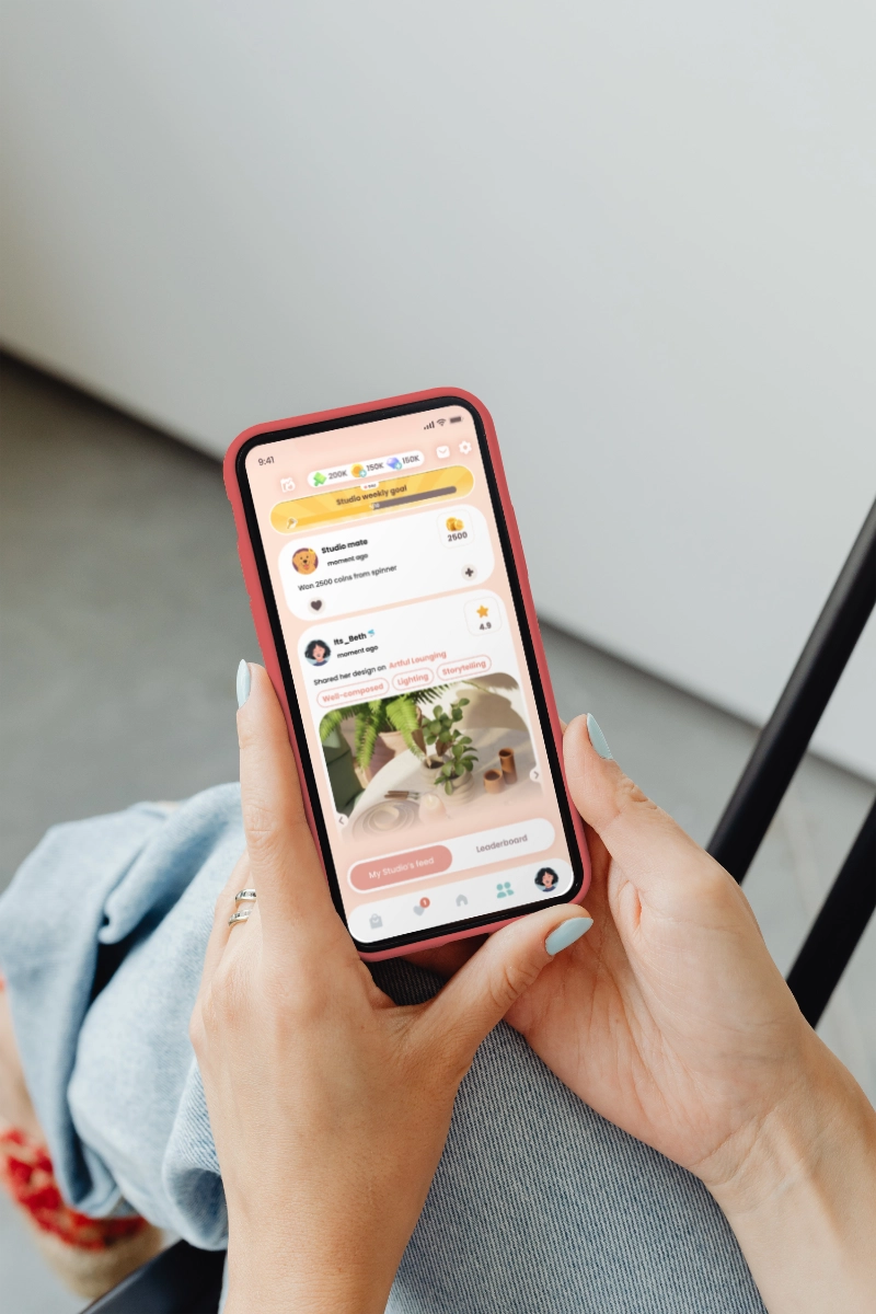
The Other feed was never built
The Social tab introduces two views: My Studio's feed and Other feed; a familiar pattern of following first, then broader exploration. Beth sees designers she follows, then system-recommended ones based on style.
The Phase 1 leaderboard remains as a placeholder, while the next iteration builds on the existing (but previously underused) following system.
Feedback tag visibility.
Do tags feed back visibly to the designer's profile, or do they disappear into the algorithm? This question has UX and business implications and isn't resolved yet.
Permanent inventory monetization.
Studio rooms unlock permanently, which creates real leaving cost.
Whether that can also be a monetization surface (cosmetic Studio items, limited room decor) is a viable direction that's been deliberately parked for now.
What I've Learned
JTBD changes the quality of every decision downstream.
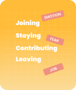
Breaking down user journeys into key moments (join, contribute, stay, leave) improves decision-making.
Good references are systems, not screens.
Looking beyond design feeds shifted the question from "how should this look?" to "what problem has already been solved at scale?"
Borrowing architecture, not aesthetics, led to more confident and grounded decisions.
AI compresses the gap between hypothesis and clarity.
Using Claude Code enabled rapid prototyping and faster iteration cycles between concept and implementation.
Key Principles I'll Carry Forward
Social mechanics should be structurally incapable of producing toxicity, not reliant on settings or moderation to prevent bad outcomes.
The moment you ask someone to join, you create a moment where they can say no. Design the belonging, not the ask.
Absence must not feel consequential. Presence should feel meaningful. Those are not the same design problem.
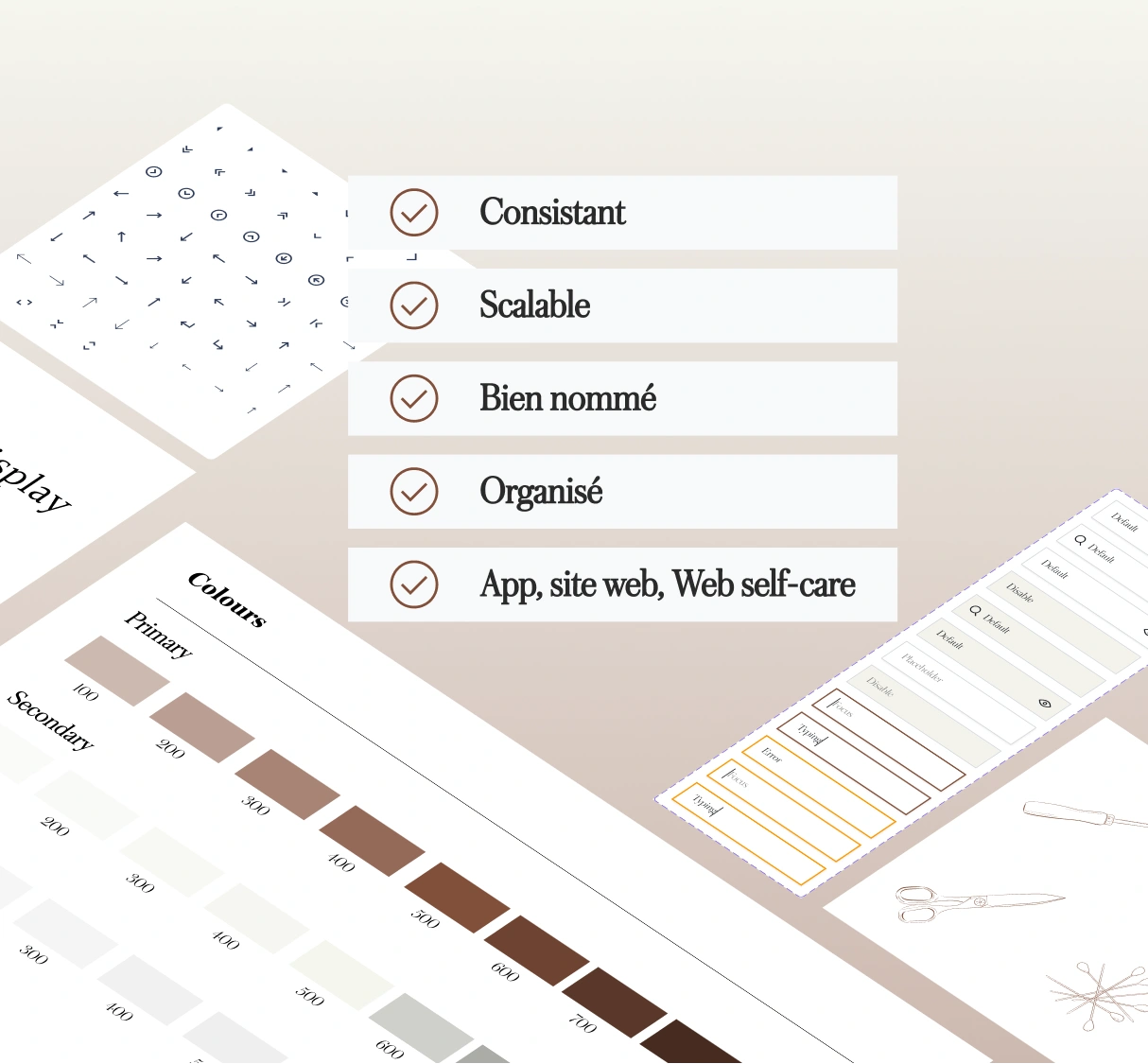
Tools & Methods
Figma (UI/UX design, prototyping)
Claude Code (rapid prototyping, interaction testing)
System design thinking
User journey mapping
Want to see the full system?
The complete deliverable set is available on request.